Small Hours / 30-style modular UI asset library
Dispatch UI
30 coordinated UI styles with precut, text-free PNGs, editable SVGs and Godot Themes. Try a complete Paper style free, then choose the full library.
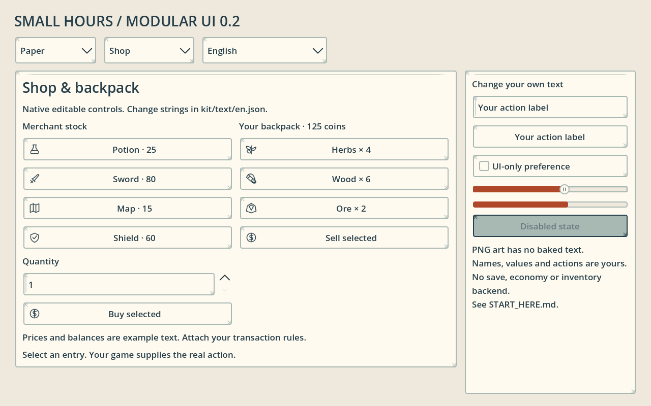
576 PNG + 288 SVG · atlas JSON · Godot 4 examples
MIT · commercial use
English documentation, Text-free art; partial French title replacement example
Dispatch UI 0.2 / actual free files
Try the parts with your own text.
The full collection / updated 2026-11-03
30 coordinated styles. One naming system.
Each style includes the same 192 UI part/state entries and 96 icon shapes: menus and settings, inventory and equipment, shop and crafting, dialogue and quests, levels and rewards, calendar and HUD.
Precut transparent PNGs at 1x/2x, editable text-free SVGs, atlas coordinates and LEFT / TOP / RIGHT / BOTTOM slice margins. The text is yours. Assign a Godot Theme or use the example adapter.
8640 styled entries become 17,280 single PNG exports at two sizes. States, themes and export sizes are counted separately; the themes share component structures and icon shapes.
Full kit on itch.io · $4.90 ↗Free sample vs full kit
| Included | Free | $4.90 kit |
|---|---|---|
| Coordinated styles | Paper | 30 |
| UI part/state entries per style | 192 | 192 |
| Icon shapes per style | 96 | 96 |
| Individual PNGs, 1x + 2x | 576 | 17,280 |
| Editable new scene examples | 16 | 16 |
| Godot Theme resources | 1 | 30 |
| SVG, atlas, JSON, adapter | Yes | Yes |
| License | MIT | MIT |
Full kit also retains four original 0.1 scenes as legacy extras. Fonts and game systems are not included.
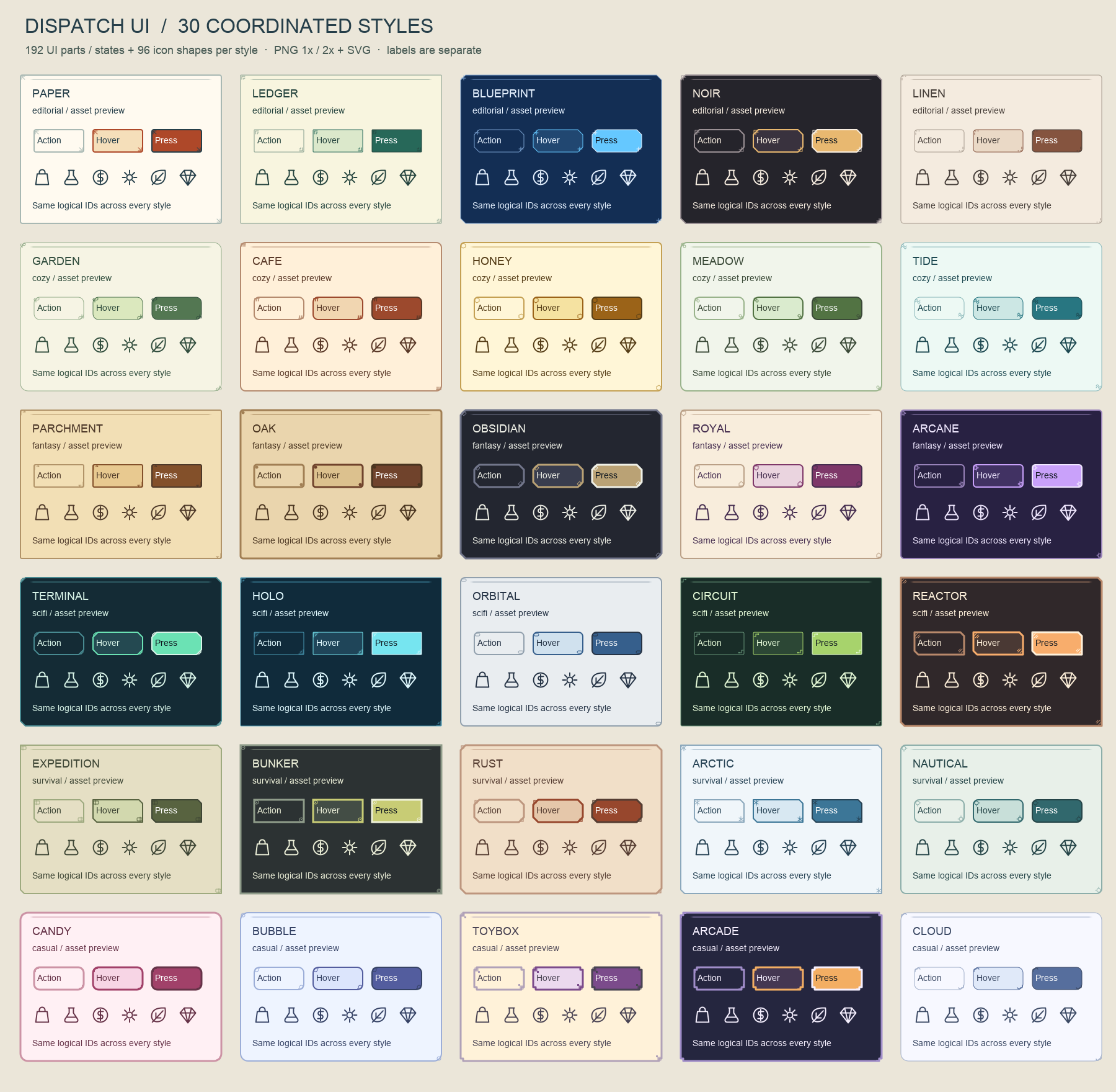
See every included style.
Actual PNG parts with separate preview labels. Palette and border treatments vary; the 96 icon shapes are shared. Open the sheet to inspect it at full size.
Editorial / narrative
Paper · Ledger · Blueprint · Noir · Linen
Cozy / life sim
Garden · Cafe · Honey · Meadow · Tide
Fantasy
Parchment · Oak · Obsidian · Royal · Arcane
Science fiction
Terminal · Holo · Orbital · Circuit · Reactor
Exploration / survival
Expedition · Bunker · Rust · Arctic · Nautical
Casual
Candy · Bubble · Toybox · Arcade · Cloud
Compositions you can edit.
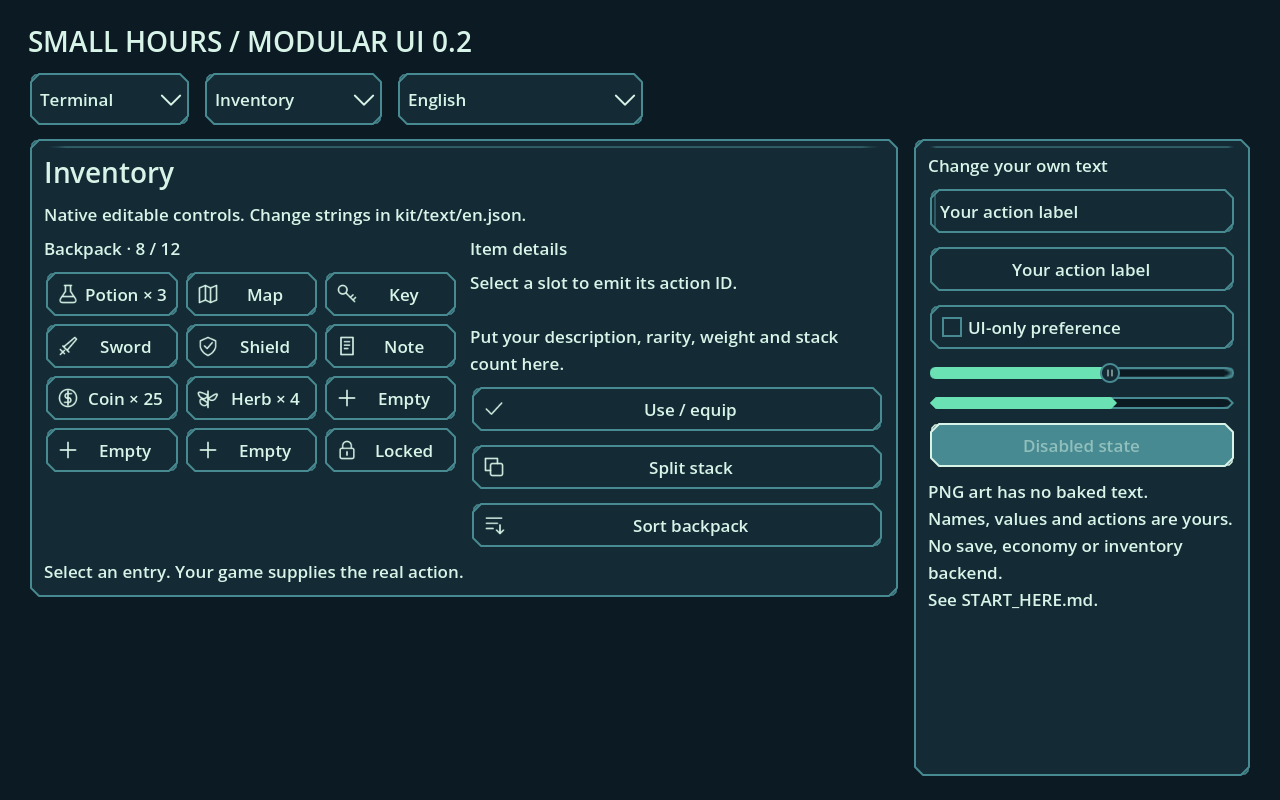
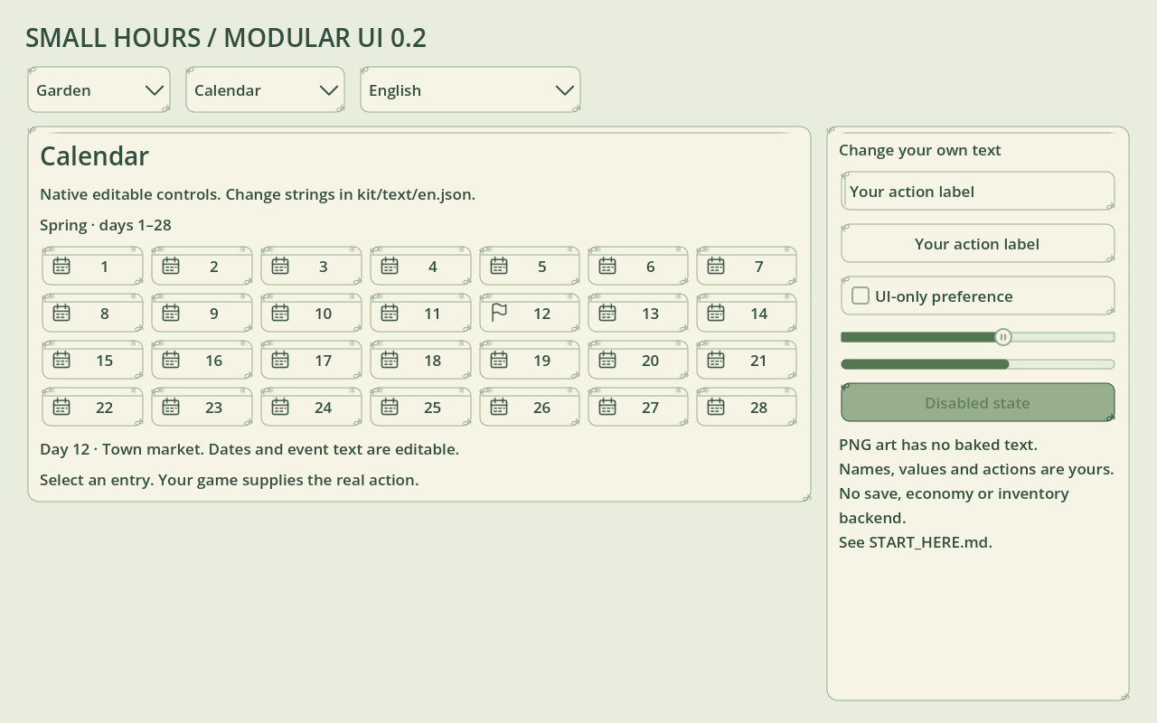
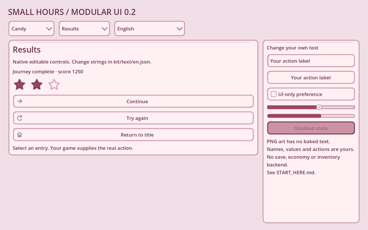
From a file to your own button
Copy kit/ into res://kit/, assign kit/themes/paper.tres to a Control, then instance a scene or create a native Button with your own text. Connect action_requested to your game. The free sample uses the same paths and IDs as the full kit.
English docs; partial French titles demonstrate text replacement. No font files are bundled. Tested runtime scope and limitations are inside the ZIP.
Read the import guide →Notes from the worktable
A little help getting started.
Short, practical guides using the actual files on this shelf.
01 / Art files
Import the icons
Check transparent PNG edges, pick a state, and find atlas frame coordinates.
Read the guide →02 / Scene art
Plan a background scene
Test a dialogue area, keep aspect ratios intact, and compare states.
Read the guide →03 / Godot menus
Add a native Theme
Import the free sample, assign a Theme, and connect a pause-menu signal.
Read the guide →